

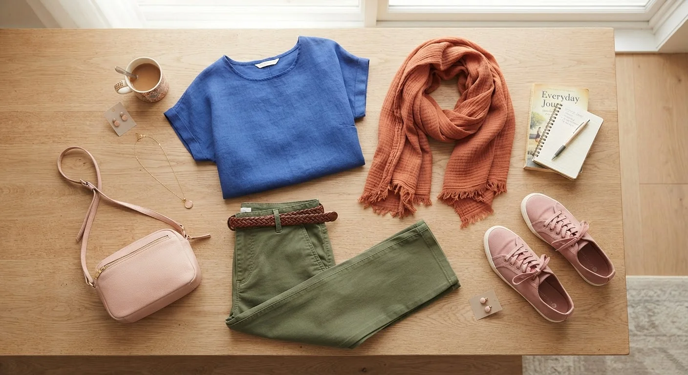
Key Takeaways
- Neutral bases make it easier to introduce color without overwhelming an outfit.
- Repeating one color in two places in an outfit creates a sense of visual intention.
- Wearing colors you already gravitate toward is the most reliable starting point.
- Tonal dressing - layering shades of the same color - is a low-risk, polished approach.
- Understanding warm vs. cool tones is the most practical slice of color theory to absorb.
What you will need
Why Color Feels Complicated (And Why It Doesn't Have to Be)
Formal color theory - the kind involving color wheels, complementary pairs, and triadic schemes - was built for designers and artists working at a technical level. When that vocabulary gets transplanted into everyday style advice, it often creates more anxiety than it resolves. Most people don't need to memorize color relationships; they need a handful of practical principles that actually hold up when they're standing in front of their closet at 7 a.m.
The good news is that color intuition is something most of us already have in a rough form. We know when something feels off and when an outfit just works. The goal here isn't to replace that instinct with rules - it's to give it a bit of structure so the decisions come faster and with more confidence. If you've ever wanted to branch out from a wardrobe of blacks, grays, and navies but weren't sure where to start, this guide is for you.
The Concepts Worth Actually Knowing
Skip most of color theory and focus on two ideas that translate directly to getting dressed.
Warm versus cool tones. Colors run along a spectrum from warm (reds, oranges, yellows, earthy tones) to cool (blues, purples, blue-based greens). Within any color family - even neutrals - there's a warm and a cool version. An ivory sweater reads warm; a stark white reads cool. A camel coat is warm; a light gray is cool. Mixing heavily from both ends in one outfit can create a subtle discord that's hard to name but easy to feel. Staying mostly in one temperature register tends to look cohesive without any additional effort.
Saturation. This is how vivid or muted a color is. A bright cobalt and a dusty slate are both blue, but at very different saturations. Mixing similar saturation levels - all muted, or all vivid - tends to look intentional. Mixing a neon with a faded vintage tone often reads as accidental rather than artful. If you love bold color, go bold in multiple pieces. If you prefer softer, faded palettes, keep them consistently soft.
Your Existing Wardrobe Is the Best Research
Before buying anything new, spend five minutes grouping your clothes by color family. Most people discover they naturally gravitate to two or three color temperatures, which is all the information needed to shop and dress more intentionally. The pattern often points to what genuinely flatters you - and what tends to go unworn.
For a deeper look at how these principles interact with patterns, see our guide on mixing patterns and prints.
Step-by-Step: Building a Color-Confident Outfit
Start with what you already reach for
Before you try to expand your palette, look at the colors already in your closet. What do you actually wear repeatedly? Those colors are telling you something - they probably suit your coloring, your lifestyle, or your mood. Use them as anchors rather than starting from scratch.
Build from a neutral base
Ground the outfit in one neutral piece - think navy, stone, cream, tan, black, or gray - before layering in color. Neutrals absorb visual weight, so the colors you add read as intentional rather than chaotic. A pair of straight-leg tan trousers or a simple white shirt gives your eye somewhere to rest.
Introduce one color, then echo it
Pick one color to feature - say, a terracotta top. Then look for a small echo of that color somewhere else in the outfit: a bag with a tan or orange undertone, earrings with a warm amber tone, or shoes in a cognac brown. Repeating a color or its close relative makes an outfit feel like it was thought through, even if it took two minutes.
Try tonal dressing as a low-stakes experiment
Tonal dressing means wearing multiple shades of the same color family together - light sage with deeper olive, or cream with oat with tan. It's one of the most forgiving approaches to color because the pieces are harmonious by definition. It's also a good way to start wearing color more confidently without the risk of a clash.
Check temperature before you commit
Before finalizing the outfit, do a quick warm/cool scan. Are most pieces sitting in the same temperature register? If you spot an outlier - say, a cool-toned lavender in an otherwise warm rust-and-camel outfit - consider swapping it or anchoring it with something that bridges the gap. This single habit eliminates most of the subtle clashes people can't quite identify.
Adjust for the occasion
Brighter, higher-saturation colors tend to read as more casual and expressive; muted, lower-saturation tones can feel more formal or refined. A vivid yellow dress is perfect for a weekend outing but might distract in a job interview setting, where a dusty yellow or warm cream achieves a similar effect with less visual volume. Our occasion dressing reference guide covers what color and tone choices work in specific contexts.
Common Pitfalls and How to Sidestep Them
The most frequent color mistake isn't wearing too much of it - it's wearing colors that fight each other in tone or saturation without anything to anchor them. A useful mental check: does each piece in the outfit share at least one quality with another piece? That might be temperature, saturation level, or simply a repeated color note somewhere.
Don't Buy Bold Colors Without a Plan
A striking statement piece in a color you don't own anything else in can be exciting in the moment but impractical at home. Before purchasing a strong color, think through at least two or three outfits you could build around it with what you already own. If you can't get there easily, it may be worth reconsidering - or saving it for a deliberate wardrobe expansion.
Another pitfall is buying statement-color pieces in isolation without thinking about what you already own. A vivid coral blazer is exciting in the store, but if your entire wardrobe is cool-toned, it may end up unworn. Before adding a bold color piece, mentally run through three outfits you could build around it at home.
If you're exploring how color fits into a broader wardrobe strategy, the capsule wardrobe guide covers how to build a coherent closet from the ground up - color included.