

| Origin of 'chiaroscuro' | Italian: chiaro (light) + scuro (dark) |
| Composition tools artists use | Rule of thirds, golden ratio, symmetry, diagonal lines |
| Common palette types | Warm, cool, limited, split-complementary |
| Impasto associated with | Van Gogh, Rembrandt, de Kooning |
| Negative space used prominently in | Japanese ink painting, Minimalism, graphic design |
Why Art Vocabulary Matters
Standing in front of a great painting, most of us sense that something is happening - a pull toward one corner, a weight in the shadows, a color that seems to vibrate. What we often lack is the language to describe why. That gap can make art feel like a members-only club, when in fact the vocabulary is straightforward once it's translated out of academic shorthand.
This reference is designed as a practical lookup guide. Whether you're visiting a gallery, reading a catalog essay, or simply trying to put words to what you're feeling, these terms will help. Think of them less as technical definitions and more as a shared vocabulary for noticing. For a broader orientation to engaging with visual art without formal training, see our guide for viewers without a formal background.
Chiaroscuro
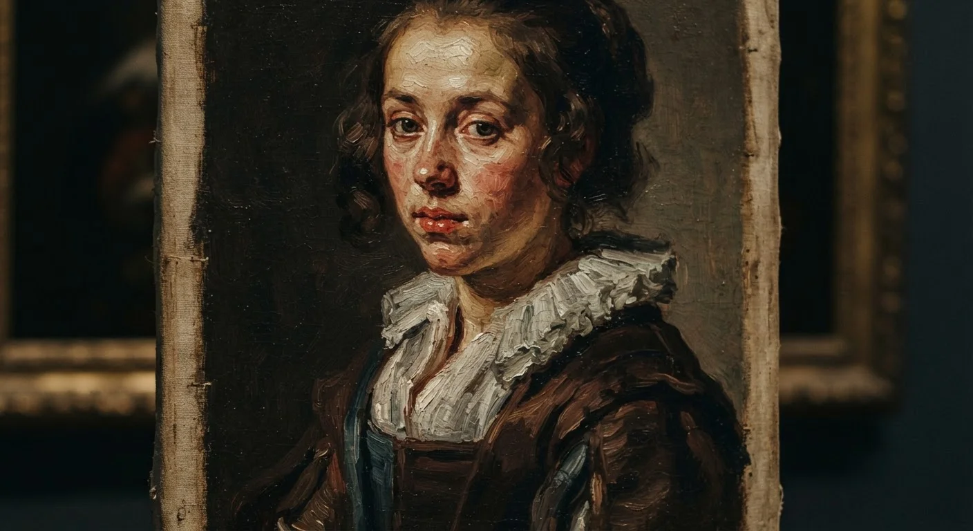
The use of strong contrasts between light and dark to model three-dimensional form and create dramatic atmosphere. Associated especially with Baroque painters like Caravaggio.
Composition
The deliberate arrangement of all visual elements within a painting - figures, objects, color areas, and empty space - to guide the viewer's eye and create meaning or mood.
Negative space
The area around and between subjects in an image. Skilled artists shape negative space intentionally to define subjects, create balance, and control visual rhythm.
Palette
The range of colors an artist chose to use in a particular work. A painting's palette sets its emotional temperature and is often a key element of an artist's recognizable style.
Impasto
A technique in which paint is applied very thickly, leaving visible texture and brushstroke ridges on the surface. Van Gogh's swirling skies are a well-known example.
Complementary colors
Color pairs that sit opposite each other on the color wheel, such as red and green or blue and orange. When placed adjacent, they intensify each other visually.
Foreshortening
A perspective technique that makes objects or limbs appear to project toward the viewer by compressing their length as they recede in space.
Ground
The prepared surface applied to a canvas or panel before painting begins. The ground affects how paint adheres and how colors appear - a tinted ground can unify a painting's overall tone.
Core Visual Terms, Explained
The terms below cover the building blocks most commonly referenced in wall text, criticism, and conversation. Each one points to something you can actually look for - a concrete element to locate with your eyes.
| Origin of 'chiaroscuro' | Italian: chiaro (light) + scuro (dark) |
| Composition tools artists use | Rule of thirds, golden ratio, symmetry, diagonal lines |
| Common palette types | Warm, cool, limited, split-complementary |
| Impasto associated with | Van Gogh, Rembrandt, de Kooning |
| Negative space used prominently in | Japanese ink painting, Minimalism, graphic design |
Light and Shadow
Chiaroscuro (kee-ar-oh-SKYOOR-oh) is the Italian term for the dramatic use of light and dark contrast. Artists like Caravaggio and Rembrandt used it to make figures seem to emerge from shadow the way a face appears under a single lamp. When a painting feels almost theatrical in its lighting - as if a spotlight is involved - chiaroscuro is almost certainly at work.
Space and Structure
Composition refers to how all elements in the painting are arranged. It's the underlying decision about where things sit: what's centered, what's pushed to an edge, what leads your eye across the canvas. A strong composition creates a sense of order or deliberate tension - even in chaotic subject matter.
Negative space is the area around and between subjects - the sky behind a figure, the gap between two hands. Far from being empty, negative space shapes the subjects themselves and controls the visual rhythm of the whole image.
Color Relationships
Palette means the range of colors an artist chose to work with in a given piece - not the physical tray, but the visual fingerprint those choices leave. A warm palette (reds, oranges, yellows) reads differently from a cool one (blues, greens, grays), and the choice is rarely accidental.
Complementary colors sit opposite each other on the color wheel - red and green, blue and orange. Placed side by side, they intensify each other. Artists use this to create vibration and visual energy in specific areas of a canvas.
If you're curious how these ideas extend into other art forms, our explainer on contemporary art shows how modern artists continue to play with and subvert these conventions.
Putting It All Together
Knowing these terms transforms a gallery visit from passive reception into active conversation with the work. Instead of asking Do I like it? as your only question, you can ask: Where does the composition draw my eye first? How does the palette make me feel before I even understand the subject? What is the negative space doing?
None of this requires a degree - only curiosity and a willingness to look slowly. For those wanting to go further, our guide to how the art world works explains galleries, critics, and how paintings move through public and private hands. And if you enjoy building visual vocabularies, the same skills apply in other arts - film has its own starter glossary worth exploring.
The goal isn't to replace emotional response with analysis - it's to deepen both at once.